Creating and setting up forms
Healee offers a diverse range of forms and questionnaires that enable providers to collect precise patient information at different points of the patient journey.
This topic describes how admins create, configure and manage forms in the Admin Panel area. For details on how providers use forms to gather patient information, see Using forms
Intake forms
To create an intake form:
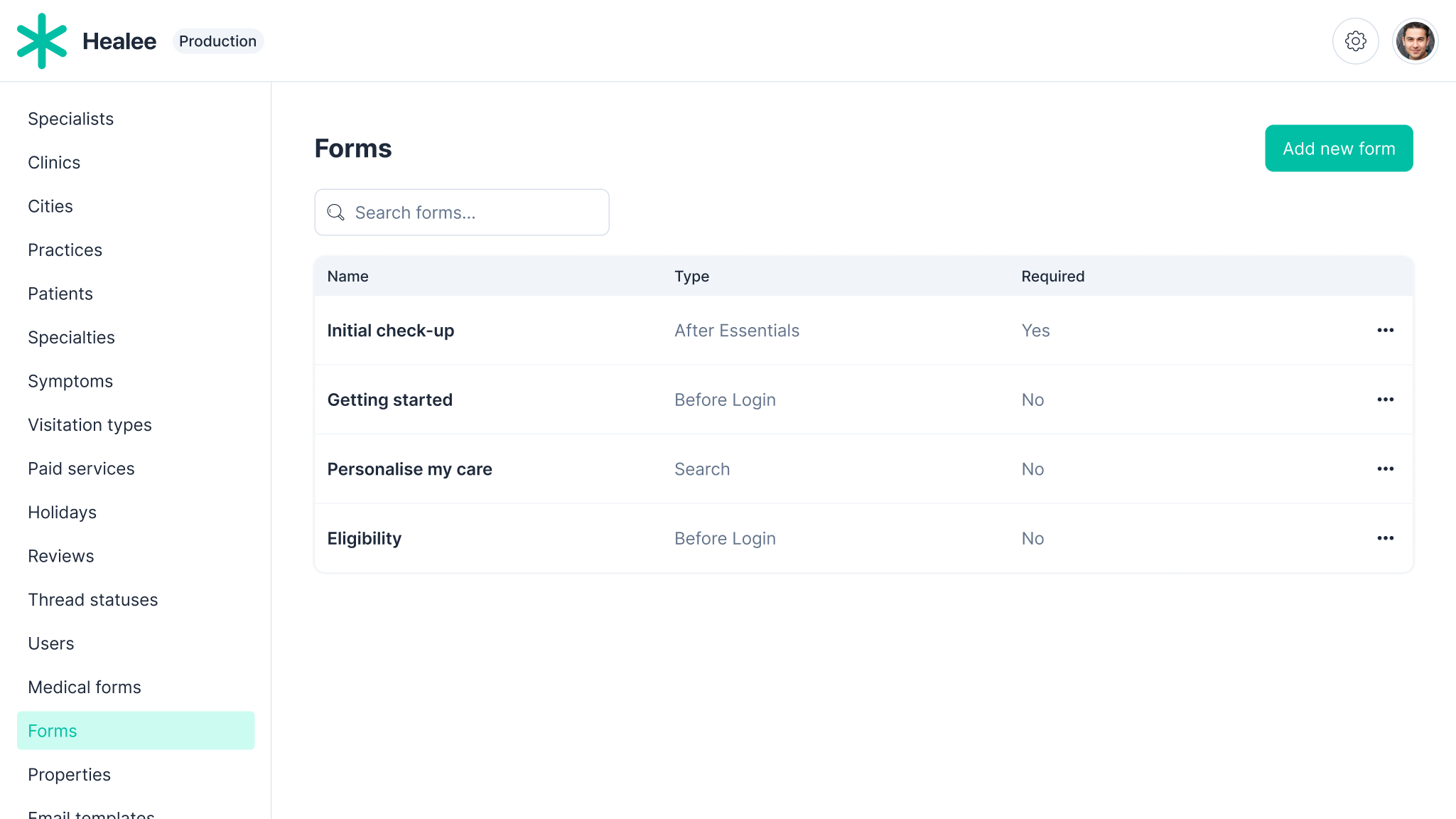
- In the Admin Panel, go to Forms
- Click Add form
- Enter the form definition, set the form properties
- When ready, click Save or Save and close.
The following options are valid for intake forms:
Format (Definition): JSON
All forms must be in a valid json format. If there is an error in the code, the system will not allow the user to save it until it has been fixed
Type (placement):
This property defines the point/stage of the patient journey at which the form will be triggered:
- After Essentials - the step of the patient registration process where patients enter their name, phone number and other demographic data. This step completes the account creation process.
- Before Registration - prior to the first step of the account creation process (where the patient enters their email address).
- Search - refers to the search area showcasing all practitioners in the platform, visible to patients once the registration process has been completed
ID: used as reference to the form, especially important for the creation of rules (see Admin Guide > Rules).
Skip Token: allows the user to skip the form.
Properties:
- Required - whether the user has to fill it or not.
- Default - if there are multiple forms to choose from, one can be set as the default one for all patients.
Submission:
- Overwrites the previous entry - if the user fills in the form more than once, each successive copy will get updated as the newest one and there will be no separate copies
- Save data as new entry - if the user fills in the form more than once, each iteration will be saved separately to their profile
In-thread forms
To create an In-thread or a Note form:
- In the Admin Panel, go to Medical Forms
- Click Add form and choose Patient or Specialist, respectively
- Enter the form definition, set the form properties
- When ready, click Save or Save and close
The following options are valid for In-thread forms:
Format: JSON
Type: for Patient, for Provider
Specialties: The intake forms can be added to a specific practitioner's profile or to a group of practitioners based on their specialty/ies.
Send automatically:
- On first patient appointment - the trigger is the booking of the initial appointment by a patient or a practitioner on behalf of a patient.
- After each video/audio appointment - after an audio or video call has been completed in the platform between the patient and practitioner.
- When patient connected to specialist - upon the creation of the message thread, which might not necessarily be triggered by the booking of an appointment.
Note forms
The provider/note forms, like the patient intake forms, are created in the panel admin area in a JSON format. They can be tied to a specific practitioner or a group of practitioners.
Provider forms are completed and submitted by the practitioner and are stored in the patient's folder in the practitioner's account. The provider forms can be shared with the patient or be kept private to the practitioner only. Depending upon the setup of the entire replica, these might be automatically shared with other practitioners upon connecting with the patient (“shared mode”) or might remain hidden and visible only to the practitioner that created them (“private mode”).
In order to keep a provider form private even in “shared mode”, the following code needs to be entered into the JSON code
"formOptions": {
  "privateForm": boolean
}
List of form properties and core attributes
{
  "formName": string,
  "formType": "chat" | "typeform", // For "eligibility flows" the only supported mode is "typeform". For "patient charting", "intake forms" and "protocols" - "chat" (default) and "typeform" modes are supported
  "formOptions": {
    "privateForm": boolean, // Only used in patient charting scenarios, when true the form is not added to the shared patient record
    "logKey": string,
    "dateFormat": string, // The format for the date input fields. Default: "MMDDYYYY" (for "typeform" forms), "DD MMM YYYY" (for "chat" forms)

    // The following options are supported only in "typeform" mode:
    "dateSeparator": string, // Default: "/"
    "disableProgressBar": boolean, // Default: false
    "disableWheelSwiping": boolean, // Default: false
    "disableNavigationArrows": boolean, // Default: false
    "animationDirection": "vertical" | "horizontal", // Default: "vertical"
    "showQuestionsNumbers": boolean, // Default: true
    "showLettersOnAnswers": boolean, // Default: false
    "messages": {
      "label.button.ok": string, // Default: "Ok"
      "label.hintText.enter": string, // Default: "press <strong>Enter ↵</strong>",
      "label.hintText.multipleSelection": string, // Default: "Choose as many as you like"
      "block.dropdown.placeholder": string, // Default: "Type or select an option"
      "block.dropdown.noSuggestions": string, // Default: "No Suggestions!"
      "block.shortText.placeholder": string, // Default: "Type your answer here"
      "block.longText.placeholder": string, // Default: "Type your answer here"
      "block.longText.hint": string, // Default: "<strong>Shift ⇧ + Enter ↵</strong> to make a line break"
      "block.number.placeholder": string, // Default: "Type your answer here"
      "block.email.placeholder": string, // Default: "Type your email here"
      "block.defaultThankYouScreen.label": string, // Default: "Thanks for filling this in.\n\n We will contact you soon"
      "label.hintText.key": string, // Default: "Key"
      "label.progress.percent": string, // Default: "{{progress:percent}}% completed"
      "label.errorAlert.required": string, // Default: "This field is required!"
      "label.errorAlert.date": string, // Default: "Invalid date!"
      "label.errorAlert.number": string, // Default: "Numbers only!"
      "label.errorAlert.selectionRequired": string, // Default: "Please make at least one selection!"
      "label.errorAlert.email": string, // Default: "Invalid email!"
      "label.errorAlert.url": string, // Default: "Invalid url!"
      "label.errorAlert.range": string, // Default: "Please enter a number between {{attribute:min}} and {{attribute:max}}"
      "label.errorAlert.minNum": string, // Default: "Please enter a number greater than {{attribute:min}}"
      "label.errorAlert.maxNum": string, // Default: "Please enter a number lower than {{attribute:max}}"
      "label.errorAlert.maxCharacters": string, // Default: "Maximum characters reached!"
      "label.submitBtn": string, // Default: "Submit"
      [ x: string ]: string | undefined
    },
    "theme": {
      "font": string,
      "backgroundColor": string,
      "backgroundImage": string,
      "logo: {
        "type": string,
        "src": string
      };
      "questionsColor": string,
      "answersColor": string,
      "buttonsFontColor": string,
      "buttonsBgColor": string,
      "buttonsBorderRadius": number,
      "errorsFontColor": string,
      "errorsBgColor": string,
      "progressBarFillColor": string,
      "progressBarBgColor": string
    }
  },
  "patientDetails": {
    "skip": boolean, // Indicates whether asking for patient details should be skipped (default "true" for eligibility flows)
    "visibleProps": [ string ], // "firstName", "lastName", "email", "phoneNumber", "dateOfBirth", etc.
    "requiredProps": [ string ],  // "firstName", "lastName", etc.
    "customProps": {
      "[property name]": {
        "label": string,
        "patientProp": string
      }
      ...
    }
  },
  "questions": [
    Block
  ]
}
Common question types (used both in "chat" and "typeform" mode)
Core attributes
{
  "id": string, // (optional) Used for accessing the answer value in conditions and in rules
  "q": string, // The text for the question
  "type": string, // The type of the question (see the supported types below)
  "required": boolean, // Supported only in "typeform" mode. Indicating whether providing answer to this question is mandatory
  "description": string, // Supported only in "typeform" mode. A text block appearing under the question
  "nextBtnLabel": string, // Supported only in "typeform" mode. The label of the next button
  "classnames": string, // Supported only in "typeform" mode. Custom CSS classnames for the whole question block
  "placeholder": string, // Supported only in "typeform" mode.  The question placeholder if the question has a text input
  "hiddenForPatient": boolean, // Indicating whether the question, or respectively the answer (if opening the results of a form), should be hidden for the patient
  "hiddenInPrint": boolean, // Indicating wheter the answer to the question should be hidden when viewing the results in the app or in the PDF document
  "hasTemplate": boolean // Indicating whether the text of the question and the description should be processed as templates before being shown to the user
}
1 - Type form_bot_message
Used typically for greeting messages. The user is not asked for any input
No additional attributes.
2 - Type form_select_date
No additional attributes.
3 - Type form_file_upload
{
  "required": boolean, // Default: true
  "multiple": boolean, // Default: false. Used in "typeform" mode only
  "fileType": string // Allowed file type(s)
}
4 - Type freetext
{
  "isLong": boolean, // Default: false. Used in "typeform" mode only
  "setMaxCharacters": boolean, // Used in "typeform" mode only. Default: false
  "maxCharacters": number // Used in "typeform" mode only
}
5 - Type singlechoice
{
  "choices": [
    string | { "text": string, "id": any, "weight": number }
  ]
}
6 - Type multichoice
{
  "choices": [
    string | { "text": string, "id": any, "weight": number }
  ],
  "noneOfTheseText": string // Used in "chat" mode only
}
Typeform mode question types
1 - Type dropdown
{
  "choices": [
    string | { "text": string, "id": any }
  ]
}
2 - Type number
{
  "setMin": boolean, // Default: false
  "min": number, // Default: 0
  "setMax": boolean, // Default: false
  "max": number
}
3 - Type group
Group multiple blocks on the same page
{
  "innerBlocks": [ Blocks ]
}
4 - Type statement
Shows text statement. The user is not asked for any input
{
  "buttonText": string, // Default: "Continue"
  "quotationMarks": boolean // Default: true
}
5 - Type picturechoice
{
  "choices": [
    { "text": string, "url": string, "id": any }
  ]
  "multiple": boolean // Default: false
}
6 - Type redirect
Redirects the user to a specific URL
{
  "redirectUrl": string, // The URL where the user is redirected to
  "redirectButtonLabel": string, // The label for the redirect button
  "extraParagraph": string, // Extra paragraph used for additional information provided to the user
  "iconClass": string // Custom CSS class for the redirect icon (if custom class in needed)
}
Chat mode question types
1 - Type signature
Shows a surface area where the user can draw a signature
No additional attributes.
2 - Type yes_no
Supports only two options in the "choices" array
{
  "choices": [
    string | { "text": string, "id": any }
  ]
}
3 - Type select_value
Opens a separate view for selecting the value
{
  "values": [
    string | { "text": string, "id": string }
  ]
}
4 - Type select_doctor
The user can select a provider from a list of providers_
{
  "answer_action": "book_doctor"
}
5 - Type select_from_range
{
  "choices": [
    string | { "text": string, "id": any }
  ],
  "minText": string,
  "maxText": string
}
Placeholders
In "intake forms" you can place special blocks called placeholders in the question ("q") string. During runtime they will be replaced with the respective values.
e.g. {{doctor.name}}, {{doctor.registrationNo}}, etc.
Conditions
Using a condition on a block level, you can specify the criteria under which the block will be visible.
{
  "condition": {
    "id": string, // The "id" of the block which which answer will be used for evaluating the condition
    "convert": string, // (optional) Whether the value should be converted. Currently supported: "timeDiff", "float", "int"
    "exp": string, // A math expression that can use the "weight" or the "id" (if weights are not provided) of several answers. e.g. {question1} + {question2}
    "gt": number, // (optional) Greater than
    "lt": number, // (optional) Less than
    "gte": number, // (optional) Greater than or equal
    "lte": number, // (optional) Less than or equal
    "eq": string | number, // (optional) Equal
    "neq": string | number, // (optional) Not equal
    "any": [ string | number ], // (optional) Any of the values is matched (used for "multichoice" blocks)
    "all": [ string | number ], // (optional) All of the values are matched (used for "multichoice" blocks)
    "or": [ Condition ], // (optional) Any of the sub-conditions is true
    "and": [ Condition ] // (optional) All the sub-conditions are true
  }
}
Localization
Only intake forms (/panel-admin/all-forms) can be localized at the moment. Providers are going to see the results in the language the form has been filled in, not in the language that their profile is currently set at.
The following fields can be localized:
- q
- description
- nextBtnLabel
- placeholder
- noneOfTheseText
- choices
- formOptions.messages
Examples:
// Question (same as other block props except choices)
"q": {
    "en": "Your age is",
    "bg": "Вашата възраст е"
}

// Choices - for the 2 types (with/without id)
"choices": [
   { "en": "Woman", "bg": "Жена" },
   { "id": "some_id", "text": { "en": "Man", "bg": "Мъж" } }
]

// Form options -> messages
"formOptions": {
  "messages": {
     "label.button.ok": { en: "Ok", bg: "Напред", ... },
   }
}